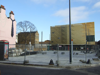
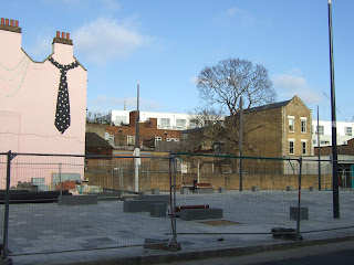
With the Deptford Lounge and Tidemill School now open, anticipation is high for the completion of the public realm works in Giffin Square. As we await the final paving blocks being laid and the seating being installed, we look forward to enjoying this new landscape in its final form.
But it seems these expectations are premature, with a new development about to begin construction on the north side of the square, bringing further disruption and mess to our newly-pristine square. Unfortunately, should the planning application that is currently being considered be approved, it will also create an uninspiring, mean and ugly facade to what should be one of the most impressive public spaces in Deptford.
The site of this development - a three-storey block with retail/restaurant units at ground level and one-bedroom and studio flats above - is the land at the back of the Deptford Seafood Centre at number 104 on the high street.
In theory I support the development of this site - having additional retail units on Giffin Square will potentially increase footfall on the square and along with the Deptford Lounge will give it a bit more life. Having residential units overlooking the square will also improve security for those using it at night, by however small an amount.
Brown and Pletts, the architect commissioned for the initial design, made a pretty good job of creating something interesting and lively on what's a rather difficult site.
Some thought did go into this design, as you can see from the original planning application here. The potential loss of light for the gardens of the adjacent high street properties (even though they are currently unused) was partially addressed by including a gap between the two main buildings to allow light to penetrate and reduce the impact somewhat.
Windows on the rear of the building, which potentially overlook adjoining gardens and properties, were designed as narrow slots with frosted glass, to allow light into the flats but prevent overlooking and loss of privacy for neighbours. And with the main windows of the flats on a south-facing wall, consideration was given to the potential problem of solar gain. To minimise the problem for residents, balconies were designed to be inset, with wooden louvre screens for shading.
The rendering above shows a visually-interesting facade with different sized windows, louvred screens and recessed balconies. The height of the block fits nicely to the lower roof line of the existing building on the right - now part of Tidemill School.
In fact the initial planning application, which was made in 2008, was turned down by Lewisham Council on the grounds that they considered it represented over-development of the site, that it would harm the mature tree in Giffin Square, and that it would overshadow and enclose the rear gardens in the neighbouring properties.
But on appeal, permission was granted by the planning inspectorate. The inspector said that although the building would have an impact on the neighbouring properties, it would not be unacceptable, and the development would serve a wider public benefit in terms of improving Giffin Square. The design would be 'interesting, pleasing and ambitious', and 'would add to the vibrancy, character and visual qualities of this locality' the inspector said. 'The choice of materials, colour and fenestration would add visual excitement and I believe a local landmark, albeit of relatively modest scale in the wider scene, would be created'.
Had the developer then gone ahead and built the scheme as proposed, you might well not be reading this.
Unfortunately the developer decided to employ a different (dare I suggest cheaper?) architectural practice to 'value engineer' (translated as 'save money on') the original design, with a new planning application now submitted for the details of the development.
Out went the range of different windows, recessed balconies and wooden louvres, to be replaced by two rows of regimented, bog-standard aluminium-framed french windows with those ugly and pointless 'Juliet' balconies slapped on top of them like lipstick on a gorilla.
Just in case you can't imagine what this would look like, the architect has helpfully (surely not proudly?) include a picture in the application as an example. See, I told you it was vile.
In such a prominent location - and next to Deptford's most high-profile public building/new development - the council must surely insist on high quality detailing and finishes? With so much public money having been spent on building Tidemill School and the Deptford Lounge, and on improving the public realm in Giffin Square, high design standards must be maintained for this and future developments.
If you feel the same way, please do write to the planning department to tell them; quote application DC/11/78353/X and send it to planning@lewisham.gov.uk as soon as you can.


14 comments:
Dear god, the difference between this and the previous proposal in unbelievable. The initial design looks like it's been transplanted from the Stirling-prize winning Acordia in Cambridge, or one of the 1960's Eric Lyons developments in Blackheath. The new one is an example of the cheapest mass-produced spec-developer tat.
Agreed, this is value engineering gone too far. If they can't make money by building something high quality on a site with such potential, then they should give up and let someone else have a go.
I will no longer have any view of the square from my terrace. I will peer on to the back of this? And I will leave Deptford for good I think! After enduring the years worth of 7 am developing even on a sat - we thought they were finally nearly finished! And now they propose to build in front of us? Block our view and put us through even more upheaval - there should be no more than a 1 level row of shops on this area. Which would still bring people onto the square- preserve the view from behind and limit the disruption we have to endure again.
So, Deptford has gone the way of Greenwich...Ugly new designs with no views and no character...How sad this is being allowed to happen! Looks more like inner city projects from America!
Why not do something that would incorporate some British structure and architecture?
Appalling!
Wall-to-wall tat. That glass iceberg opposite the Duke is nothing about looks and all about the views afforded to the fools within of their spiritual home in Canary Wharf, same with the tragideans who'll occupy that thing next to Deptford Bridge. They get a 'view', we get to look at crystal turds.
I agree, the new proposal is very bad. We overlook the site from the back and light will be reduced, never mind all the extra aggro with yet another building in this part of the high street . One way of making sure that the scheme is taken seriously is to watch very carefully for the mature tree in the garden next to the site, they will certainly try to kill it to accommodate their lump of a building.
The developer is a numpty though since the new design will not achieve any real value, people are more sophisticated than they seem to think, and with so much on offer in the area, prospective purchasers will go elsewhere rather than live in what looks like a wing of some NHS institution from the 80s.
What is that awful mural design by Artmongers doing as part of this application? It shows a mural running across to only two nasty juliet balconies and no shop front – the mural covers up the door-shaped juliet balconies next to the others shown on the elevations. In other words the mural illustrations bear no relation to the elevations. And haven't we got enough shitty murals from Artmongers already (that one on Deptford Broadway is particularly awful).
Oh sorry, I misread the elevation drawings, the mural would be facing the back of the fish shop and not on to the square. Still, another shitty mural from Artmongers will do nothing to improve the building, which reminds me of that other awful bulding on Brookmill Road that lurches out next to the Stephen Lawrence building and puts it to shame.
The new proposals are unsightly and entirely out of context - drab, uniform developments where the original aim was to provide an interesting and unique active frontage to the square.
If you consider what it is that active frontages should do in public realm -create vibrancy, interest, and a sense of wellbeing and activity-, then these mass-produced cardboard boxes will likely have the opposite effect -lack of vibrancy, lack of activity. I also hesitate to think about the effect of that sand-coloured brick (assuming the same materials will be used in Deptford as in the photo) against the golden cladding of the Deptford lounge.
Gods, it looks like a wing of the Dover district council buildings.
agreed - that truly is awful - however i dont live in your neighbourhood so i can object - a crying shame
hmm that application is just for discharge of conditions - i.e. finalising the details - im afraid you've rather missed the boat for turning down this application as it's already been approved it seems
@aphole I know, that's explained in the post. The details bear no resemblance to those shown in the original application, which was rather pleasing.
Hi, I know this is a rather old post, but I'm wondering if it's still active. I am a tenant in the ground floor flat just behind that construction site, moved in a year ago. A couple of months ago they started working on that site again, for about 2 weeks or so. Since then, nothing. The security fence is regularly torn down at night, which leaves our back yard and flat very exposed and easily accessible! I'm trying to get hold of the owner of that construction property to take care of safety but it seems more difficult than I thought. Anyway, obviously the proposal looks awful, and someone even said that a Starbucks is planned, gulp. But for the moment I worry about the security of that site. So if anyone here is still living here and worry about the same, I'm happy to to keep you update. Having said that, I am the tenant not the landlord, so not sure how far I will get!
hi anon - if you want to email me (see sidebar for address) I will bring you up to date with what I know about this site.
Post a Comment